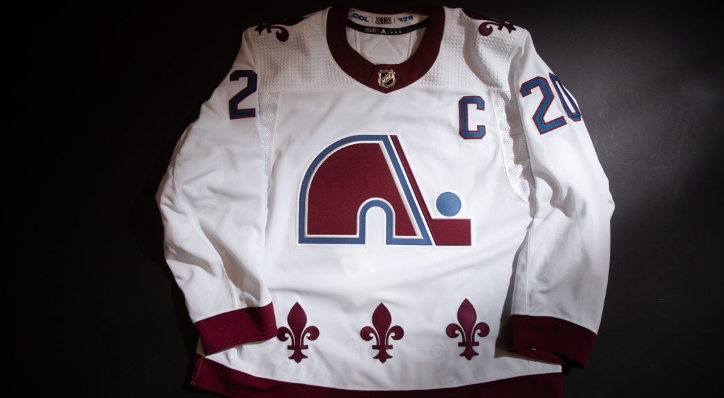
The NHL released 31 fresh takes on old threads on Monday with a new series of sweaters that make up the Reverse Retro collection.
Generally speaking, they're all pretty awesome -- who doesn't love a good reimagining of an old design? Of course, some are better than others. Here's our take on where these new/old sweaters rank
1. True throwbacks: Colorado Avalanche, Minnesota Wild, Carolina Hurricanes
The Avalanche, Wild, and Hurricanes went all-in on their throwbacks, paying homage* to their pre-relocation roots with Nordiques-, North Stars-, and Whalers-themed threads.
Secure your #mnwild jersey now » https://t.co/uuXTXb6ezk pic.twitter.com/Flsf2wJEPZ— Minnesota Wild (@mnwild) November 16, 2020
— NHL (@NHL) November 16, 2020
*Is there an argument to be made against these new/old sweaters, considering the relocation left behind some passionate hockey markets? Absolutely. But from a retro design standpoint, these win the day.
2. '90s perfection: Anaheim Ducks, Arizona Coyotes, Los Angeles Kings, St. Louis Blues
Bold, bright, and everything we could want in a '90s remix.
— NHL (@NHL) November 16, 2020
for the record, I believe the LA Kings reverse retro jersey is flawless. 10/10 pic.twitter.com/aMwbIjbxEX
— Emily Kaplan (@emilymkaplan) November 16, 2020
3. Local love: Calgary Flames, Ottawa Senators, Buffalo Sabres, Columbus Blue Jackets, New York Rangers
Flames fans' cries for the return of Ol' Blasty were rewarded, and the Senators' new/old logo is revived in red.
Blasty is backpic.twitter.com/zKCrYu695O
— Calgary Flames (@NHLFlames) November 16, 2020
The Sabres' and Blue Jackets' got the colours spot-on, while the Rangers really embraced their NYC roots.
— NHL (@NHL) November 16, 2020
— NHL (@NHL) November 16, 2020
— NHL (@NHL) November 16, 2020
4. Can't mess with a classic: Boston Bruins, Montreal Canadiens, New Jersey Devils, Philadelphia Flyers
While these don't exactly scream retro like some other teams', the clean lines and fresh colour blocks are tough to argue against.
The Canadiens' adidas #ReverseRetro jersey is inspired by the color that marked the team's first sweater in 1909.
The design is a take on the one worn from 1974 to 2007 – a period during which the club won six Stanley Cups.
https://t.co/8S9a50Hzvv#GoHabsGo pic.twitter.com/8gW0mQcnt1— Canadiens Montréal (@CanadiensMTL) November 16, 2020
#ReverseRetro | @adidashockey pic.twitter.com/olgUicFkru
— Philadelphia Flyers (@NHLFlyers) November 16, 2020
5. Deja vu all over again: Tampa Bay Lightning, Florida Panthers, Nashville Predators, Washington Capitals
It feels like the Lightning and Panthers reached all the way back in their closets for a pretty literal revival of their familiar look (not that we're complaining!) while those Capitals sweaters have us channeling Rookie Ovi a la The Goal.
Hello, old friend
Sign up to be the first to know where to get your Screaming Eagle Reverse Retro: https://t.co/ZME26EbToH pic.twitter.com/Vlagu0ZDC3— Washington Capitals (@Capitals) November 16, 2020
Lightning strikes twice.
Introducing our adidas #ReverseRetro jersey. Hitting the ice in 2021. pic.twitter.com/cJmqh6lvg8— Tampa Bay Lightning (@TBLightning) November 16, 2020
6. Nothing new: Pittsburgh Penguins, Chicago Blackhawks, Edmonton Oilers
The throwback designs and clean lines are there, but all three teams could have done a little more to breathe new life into old threads.
— NHL (@NHL) November 16, 2020
— NHL (@NHL) November 16, 2020
7. Missed opportunities: San Jose Sharks, Vancouver Canucks, Winnipeg Jets, Toronto Maple Leafs
When your primary colour is teal, it feels like retro is in your DNA -- but the Sharks' design doesn't quite meet it.
— NHL (@NHL) November 16, 2020
The Maple Leafs, Canucks, and Jets, meanwhile, have some stellar throwbacks in their repertoire they could've revived, which makes these feel a bit underwhelming and leaves us wanting fresher takes.
— NHL (@NHL) November 16, 2020
8. A little underwhelming: Detroit Red Wings, Vegas Golden Knights, Dallas Stars
The Red Wings' fresh take is nice, but looks incomplete compared to the rest of the reveals.
And in all fairness to the Golden Knights, their designers are averaging about three new sweaters per year at this rate so we're prepared to cut them some slack here.
— NHL (@NHL) November 16, 2020
9. Did you... even change anything?: New York Islanders
Is this a good-looking sweater? Absolutely. Is it the same sweater the Islanders have been sporting the past few seasons? Sort of feels like it, doesn't it?
https://news.google.com/__i/rss/rd/articles/CBMiWmh0dHBzOi8vd3d3LnNwb3J0c25ldC5jYS9uaGwvYXJ0aWNsZS9uaGwtcmV2ZXJzZS1yZXRyby1zd2VhdGVyLXJhbmtpbmdzLWF2YWxhbmNoZS13aW4tZGF5L9IBWWh0dHBzOi8vd3d3LnNwb3J0c25ldC5jYS9uaGwvbmhsLXJldmVyc2UtcmV0cm8tc3dlYXRlci1yYW5raW5ncy1hdmFsYW5jaGUtd2luLWRheS9zbi1hbXAv?oc=5
2020-11-16 20:44:00Z
52781188305301
Tidak ada komentar:
Posting Komentar