This morning, Adidas and the National Hockey League unveiled thirty-one new uniforms to be worn during the upcoming 2020-21 NHL season as part of the brand new Reverse Retro uniform promotion. These uniforms will be worn in multiple games by each team with an emphasis placed on them being worn for “rivalry games”.
Every team in the league gets one of these new Reverse Retro jerseys, a mash-up of older team logos and uniforms with modern team colours (and vise-versa). The jerseys do not replace any existing uniform in a team’s set, these are all being added to current rotations.
“NHL team jerseys have long carried deep historical significance for avid and casual hockey fans,” said Brian Jennings, NHL Chief Brand Officer and Senior Executive Vice President. “Through the years, the design of each team jersey has evolved to balance history and authenticity with cultural touchpoints. The Reverse Retro program is a celebration of the hockey jersey’s confluence of nostalgia, style and broad appeal. As a brand, Adidas sits at the epicentre of youth, sports and lifestyle and is the ideal partner for this exciting initiative.”
WATCH: NHL, Adidas Unveil All 31 Reverse Retro Uniforms
“Our goal from day one has been to work with the NHL and all of the teams to bring creativity, innovation, and energy to the sport with all that we do,” said Dan Near, Senior Director at Adidas Hockey in the official press release. “What better way to do that than to bring together the nostalgia of historical moments in each team’s history with something new via designs that have never been seen before in the sport.”
“Hockey fans love retro jerseys and Reverse Retro is a great opportunity for Adidas to work closely with the NHL and all 31 teams to bring back a design from a meaningful point in team history with a unique twist.”
Reverse Retro designs range from bringing back and remixing an unconventional alternate to simply swapping around the colours of an iconic look, some of these designs look absolutely fantastic and should be adopted by the team full-time immediately, while a couple of them don’t quite hit the mark. Nobody’s perfect, but overall this uniform series is clearly hitting more than they’re missing.
Let’s do a team-by-team breakdown…
ANAHEIM DUCKS

Throwing back to the one-year-wonder that was the Wild Wing third jersey, launched in January 1996 as part of the league’s introduction to alternate uniforms. The jersey features the Mighty Ducks of Anaheim mascot Wild Wing smashing through the ice, the 2020-21 version swaps the colours around making it a white jersey instead of jade. Everything else, including the unique font for player names and numbers, remains the same.
ARIZONA COYOTES

Another unusual alternate uniform from the 1990s is revived, this time it’s the Phoenix Coyotes green desert landscape look complete with cacti and a gecko. Here it’s been recoloured from green and black to purple and orange, it works with the new colours, the purple acts as a night sky over the desert view.
BOSTON BRUINS

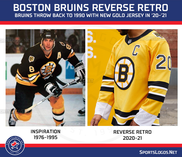
It’s amazing the Bruins haven’t tried this as an alternate uniform recently, it’s such a perfect fit. A simple swap of colours of what the Bruins wore from the mid-1970s through to the end of their time at the Boston Garden in 1995. What was black is now gold, it looks wonderful, and the return of the bear cub shoulder logo is an added bonus.
BUFFALO SABRES

The Sabres returned to their original colour scheme in 2020 and now they’ll apply those colours to some of their past steps off the path. The Sabres wore a modernized version of the sabres on a circle logo for a red alternate uniform in 2000 complete with a BUFFALO wordmark along the bottom and the “Goathead” logo on the shoulder, they’ve all been recoloured in royal blue and gold for the Sabres Reverse Retro jersey.
CALGARY FLAMES

They could’ve gone back to the Atlanta Flames or that old “podium” jersey of the mid-90s, instead, they’re bringing back Blasty! The flaming horse logo first appeared as an alternate jersey before becoming the club’s full-time road uniform around the turn of the century. The Reverse Retro jersey is largely the same design as what the club originally wore but they’ve eliminated a lot of the red from the sleeves and waist, shoulder logos now also white instead of red. An upgrade.
CAROLINA HURRICANES

Of course, the Hurricanes would fully embrace the Hartford Whalers as part of this program. Turning back to 1979, the ‘Canes are taking the original Whalers NHL design and adding grey to the colour scheme. Why? Because that’s the only colour the Hurricanes and Whalers ever shared, it’s their way of tying the two identities together. The biggest news of this jersey is the return of Pucky the Whale to the shoulders.
CHICAGO BLACKHAWKS

The Chicago Blackhawks are the only team turning back to the Original Six era by wearing a stripe-free version of their barber pole sweaters from the late-1930s (and again during the NHL’s 75th anniversary in 1991-92). Red shoulders with a black jersey, throwback circular Black Hawks logo on the chest.
COLORADO AVALANCHE

Les Nordiques! The classic Quebec logo and uniform returns to the NHL for the first time in over a quarter-century but now recoloured to match the current colour scheme of the Colorado Avalanche. The fleur-de-lis which decorated the waist and shoulders of the original Nords design are back here too.
COLUMBUS BLUE JACKETS

Columbus is turning the clock back to their expansion season but flipping the colours from blue to red. The team’s original “CBJ” logo is on the chest but sadly, the Stinger patch which was once on the shoulders is nowhere to be found here — replaced with the team’s more modern cannon logo.
DALLAS STARS

The Stars are naturally going back to what they wore when they made back-to-back appearances in the Stanley Cup Final (winning one), but the famous star-striped design has been recoloured from green, gold, and black to match the team’s new green and silver colour scheme. This results in some hard-to-see silver on white applications, including on the team’s primary logo.
DETROIT RED WINGS

A bit of a head-scratcher here, the Red Wings took their red home jersey, coloured it white, and replaced the stripes with, no… not red, silver. The result is something that looks more like a practice jersey, the only colour on the uniform is the team’s primary crest on the chest. The silver is a nod to the Centennial Classic jerseys the team wore in 2017, the team is officially throwing back to 1998 when they won the second of two straight Stanley Cups.
EDMONTON OILERS

Edmonton is going back to their first season in the NHL and swapping some colours around. The shoulder yoke, usually blue with orange trim, is now orange with blue trim (this looks good!), it gives a look similar to what the team wore in the WHA back in the early 1970s. Player name and numbers are also swapping their colours around as the Oilers continue to fully embrace the orange over the blue throughout their uniform set.
FLORIDA PANTHERS

The Panthers’ original uniform set, I feel, is one of the most underrated throughout the NHL, so it’s nice to see the team bringing that back here even if it’s in the wrong colours. Florida is opting to use their modern colour scheme of navy blue, red, and gold on their 1990s set, which is close (and still looks good), but the gold doesn’t quite have the same punch as that bright yellow the team originally wore.
LOS ANGELES KINGS

A mixing up of two eras here, the L.A. Kings are taking their 1988-98 uniform and logo (which were black and silver) and recolouring them in their original colour scheme of purple and gold. The result is surprisingly good, the Kings’ 90s logo really pops in white with the purple and gold trim… a shame Gretzky never got to wear this.
MINNESOTA WILD

Another combo of eras, this time transcending franchises. The Minnesota Wild are tapping into their state’s NHL history by combining the logo of their current team with the uniform and colours of the former Minnesota North Stars. Here, the Wild are using the jersey template worn in 1978 by the North Stars with the green shoulders and big sleeve striping.
MONTREAL CANADIENS

Here’s one that should’ve been done years ago, the Montreal Canadiens are finally trying a blue version of their famous bleu-blanc-et-rouge horizontally striped sweater. And no surprise here, it looks great like this. Add this as a permanent alternate immediately, s’il vous plaît.
NASHVILLE PREDATORS

This may be my favourite of the bunch, based purely on photos of the jerseys on models. The Predators are going back to their expansion season uniform design with the big silver sleeves and striping up the sides of the jersey and replacing the colours with the modern gold and blue. What we have here is something the Predators could easily roll with as their full-time home (or road… it’s yellow, afterall) uniform.
NEW JERSEY DEVILS

We all knew the Devils would wear green, it’s really their only option for throwing back (well, unless they ever want to break out some sweet Colorado Rockies uniforms). New Jersey will wear a colour flipped version of their original 1982-83 uniforms, green and red are swapped giving us a green jersey with red shoulders. It looks fine.
NEW YORK ISLANDERS

Every party needs a pooper, that’s why we invited you. The New York Islanders somehow missed the amazing opportunity to bring back the Fisherman jersey for this promotion and instead went with what is essentially the exact same design they wear now with minimal changes. The colour blue is darker, and the stripes have been swapped around. It’s the sort of jersey that nobody would even notice was different unless someone pointed it out to you.
NEW YORK RANGERS

After 14 long years, the Statue of Liberty is back. The Rangers returning Lady Liberty to the front of their Reverse Retro uniforms with a slightly different jersey design (the red from the waist and sleeves is gone). New York even brought back the modernized Rangers shield logo to the shoulders. This was worn as an alternate uniform from 1997 through 2007 with it being replaced for just one season in there with a white version.
OTTAWA SENATORS

I know the Senators said they won’t have an alternate uniform this season (this doesn’t count), but I may encourage them to stop working on one and just adopt this. As a red version of what’s essentially their new uniform set it would slide right in alongside what they’re already wearing. This is a colour flipped version of the Sens expansion season uniforms, red and black get swapped around.
PHILADELPHIA FLYERS

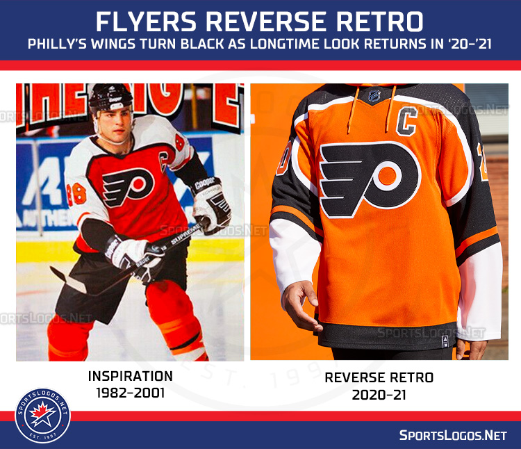
Another winner here, the Philadelphia Flyers throwing back to the days of the Legion of Doom and Eric Lindros but changing the colour of their sleeves from white to black. It looks great! The Flyers originally wore this uniform set throughout the 1980s and 1990s including several trips to the Stanley Cup Finals.
PITTSBURGH PENGUINS

Sorry, no “Robo Penguin“. The Penguins are instead throwing back to probably the least interesting of all their uniforms, the New York Rangers-style “PITTSBURGH” diagonal jerseys, originally worn on black from 1992 through 1997. A real shame here is that the Robo-Penguin was originally worn on the shoulders of this jersey but has been replaced here with a triangle-free version of the Pens modern logo.
SAN JOSE SHARKS

The Sharks are going back to the team’s first-ever alternate uniform, introduced in the late 1990s before being adopted as the team’s full-time set until 2007. Here the Sharks have recoloured the jersey grey and kept the unique sleeve striping.
ST. LOUIS BLUES

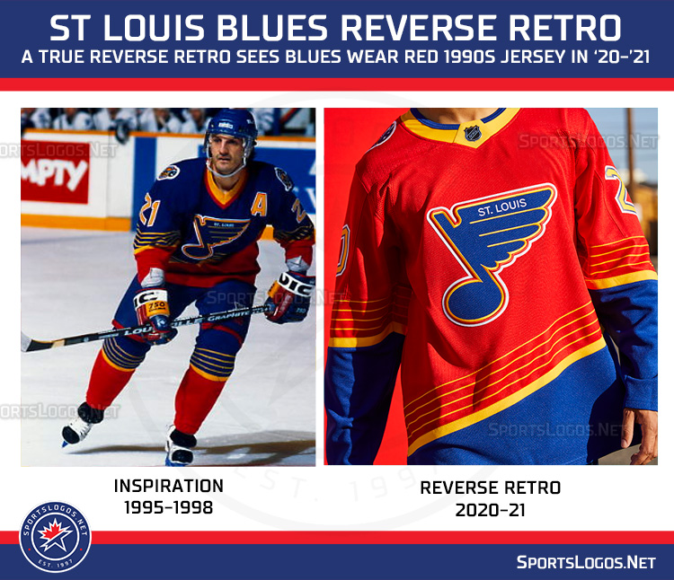
They’re the Blues, right? Well, at least they embraced the concept with open arms here. Going back to their polarizing 1990s set, the Blues have flipped the colours around, instead, they’re wearing a mostly red top with blue striping at the bottom. As they originally were, the numbers are yellow. The trumpet logo returns as a shoulder patch (pay attention, Penguins & Columbus).
TAMPA BAY LIGHTNING

Here’s another “should’ve been an alternate” uniform, the Tampa Bay Lightning celebrate their first Stanley Cup Championship from 2004 by wearing a blue version of the home blacks worn that season. No other changes here, even the victory stripes are there under the arms. Well done.
TORONTO MAPLE LEAFS

I’m confused by some of the choices on this one… the Leafs are throwing back to 1970-92 but have dropped the logo that was actually worn with this jersey and replacing it with what they wore from 1967-70 (but still keeping the proper logo on the shoulders). On top of that, the chest logo (which appears massive in this photo) is presented as blue on a blue jersey, as are the player numbers. The addition of silver to the shoulder and waist striping is a neat touch but I don’t quite get what happened with the logo and numbers.
VANCOUVER CANUCKS

Vancouver is throwing back twenty years to an alternate uniform that many have overlooked in the club’s history, a welcome surprise, as I just assumed we’d see them go back to the flying skate once again. Another surprise here is just how great the uniform looks by applying their modern green and blue colour scheme to the 2001 blue-to-red gradient uniform.
VEGAS GOLDEN KNIGHTS

With not much of a history of their own, the Golden Knights are instead focusing on Las Vegas hockey history by wearing a striping design similar to that used by the 1990s Las Vegas Thunder of the old International Hockey League. The jersey remains in the Golden Knights usual colour scheme but now with red as the dominating colour and the club’s secondary logo as the main element on the jersey.
WASHINGTON CAPITALS

The Caps are going back to the 90s (Islanders should’ve got in on this) and have recoloured their (originally blue and black) soaring eagle jerseys to match the team’s current red, white, and blue colour scheme. It looks great in the modern colours, as does the old U.S. Capitol Dome shoulder patch logo which is also returning with this set.
WINNIPEG JETS

I see what the Jets were trying here but I think it just misses. Winnipeg applied their current double blue and silver colour scheme to the original Jets’ original NHL uniforms worn from 1979-90 but the logo looks odd here in such a dark colour combo, maybe we’re just too used to seeing it in that bright 80s blue and red? Fun fact, the original Winnipeg Jets almost switched their colours to blue and silver in 1989 but backed off quite late in the game, they even produced uniforms and held on-ice focus group tests. Thirty years later, it’s finally happened.
There they are, all 31 of the NHL’s Reverse Retro uniforms for the 2020-21 season. They’ll be available for sale online on December 1st before a wider release on December 6th.
If you want more on this, I go much more in-depth, including multiple detailed, close-up photos for every team in my NHL Reverse Retro Uniform Youtube video here.
https://news.google.com/__i/rss/rd/articles/CBMiamh0dHBzOi8vbmV3cy5zcG9ydHNsb2dvcy5uZXQvMjAyMC8xMS8xNi9uaGwtYWRpZGFzLXVudmVpbC1yZXZlcnNlLXJldHJvLWplcnNleXMtZm9yLWFsbC0zMS10ZWFtcy9ob2NrZXktMi_SAQA?oc=5
2020-11-16 14:58:00Z
52781188305301
Tidak ada komentar:
Posting Komentar